
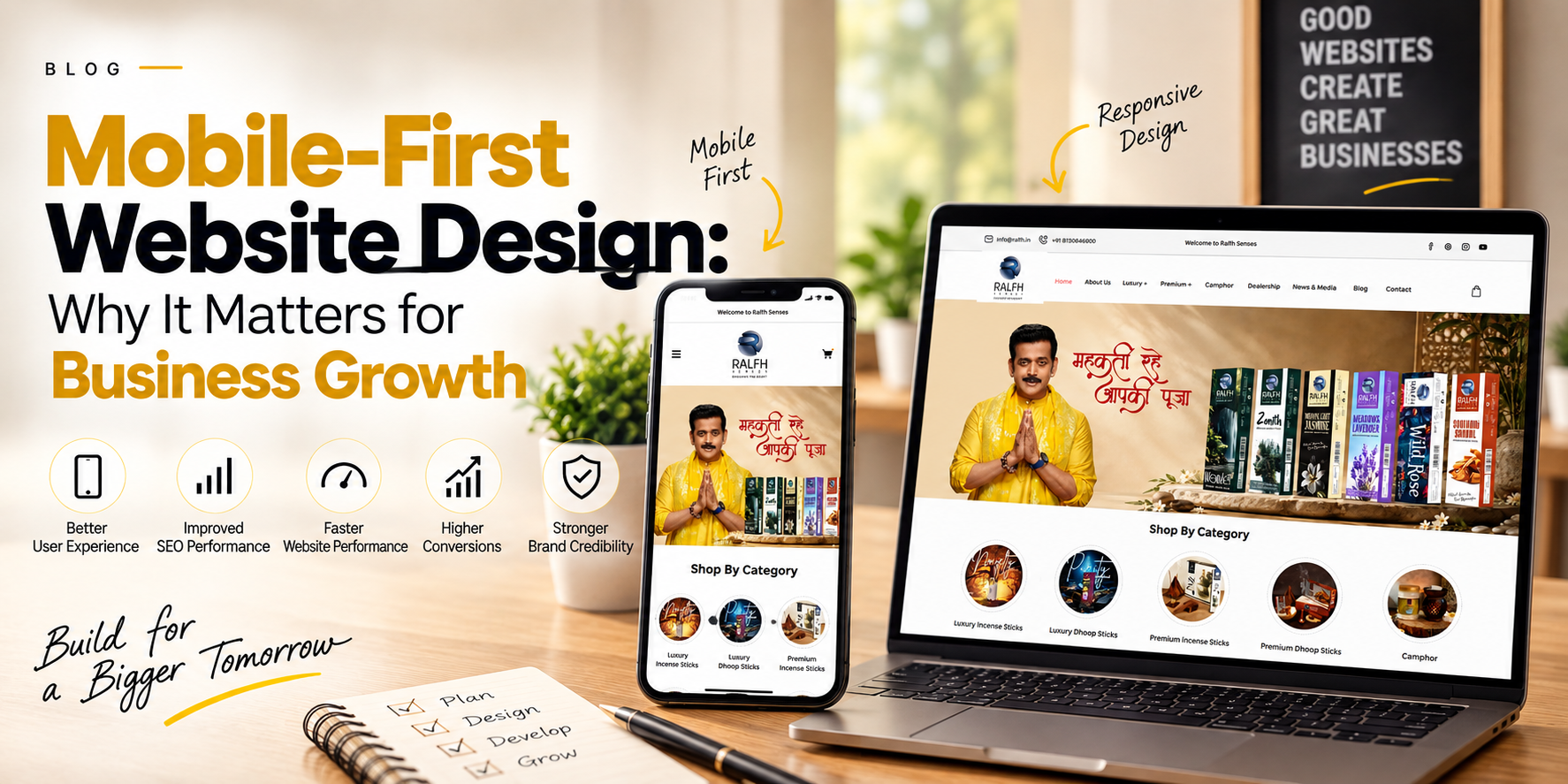
In today’s digital landscape, your website is often the first interaction a potential customer has with your business. And increasingly, that interaction happens on a smartphone. From searching for products and services to comparing brands and making purchases, users expect websites to work smoothly on smaller screens. This is why mobile-first website design has become an important part of a successful digital strategy. A mobile-first approach means designing a website for mobile devices first and then adapting the experience for larger screens such as tablets and desktops. Rather than treating mobile responsiveness as an additional feature, businesses can make it a core part of their website strategy.
Mobile-first website design is an approach where the website experience is initially planned around smaller screens. Designers and developers focus on essential content, simple navigation, readable typography, fast loading, and touch-friendly interactions before expanding the design for desktop users. This approach is particularly relevant because users may access a business website from different devices throughout their customer journey. A visitor might discover a brand through social media on a smartphone, research it later on a laptop, and finally return to their phone to make an enquiry or purchase. A website that provides a consistent experience across these devices can make the journey much easier.
1. Better User Experience
Visitors expect websites to be easy to navigate regardless of screen size. A mobile-friendly website should make important information easy to find, buttons simple to tap, and forms comfortable to complete.
If users have to zoom in, scroll excessively, or struggle with navigation, they may leave the website and look for another option.
Mobile-first design helps businesses create a cleaner and more convenient browsing experience.
2. Supports SEO Performance
Mobile usability is an important consideration for modern search visibility. Search engines evaluate how websites perform for users, while factors such as page experience, usability, and technical performance can influence organic search performance.
A responsive, well-structured website can make it easier for search engines to crawl and understand your content while providing a better experience for visitors.
This means mobile SEO should be considered alongside content, keywords, technical SEO, and other optimization activities.
3. Faster Website Performance
Mobile users may browse websites using different network conditions and devices. A website filled with unnecessarily large images, complex animations, or excessive scripts can take longer to load.
Mobile-first development encourages businesses to prioritize essential content and performance.
Optimizing images, reducing unnecessary code, improving hosting performance, and implementing efficient design practices can help create a faster website experience.
4. Higher Conversion Opportunities
The purpose of a business website is not simply to generate traffic. It should also help visitors take meaningful actions.
Depending on the business, this could include:
Filling out a contact form
Calling the company
Requesting a quotation
Booking an appointment
Purchasing a product
Downloading information
Signing up for updates
A mobile-first design can make these actions easier by keeping calls-to-action visible, forms simple, and navigation intuitive.
5. Builds Brand Credibility
Your website reflects your business. An outdated or difficult-to-use mobile website can create a poor first impression, even if your products or services are excellent.
A modern mobile-friendly website can communicate professionalism and attention to customer experience.
For businesses competing in crowded markets, these small details can influence how potential customers perceive the brand.
A successful mobile-first website should focus on more than simply shrinking a desktop design.
Important elements include:
Responsive layouts: Content should adapt naturally to different screen sizes.
Simple navigation: Users should be able to find important pages without unnecessary steps.
Readable typography: Text should remain comfortable to read without zooming.
Touch-friendly buttons: Interactive elements should be appropriately sized and spaced.
Optimized images: Visuals should maintain quality without unnecessarily increasing page weight.
Clear calls-to-action: Important actions should be easy to identify.
Fast loading: Performance should be considered from the beginning of development.
A website sits at the centre of many digital marketing activities. SEO may bring organic visitors, paid advertising can generate targeted traffic, and social media can introduce customers to the brand. But when those users reach the website, the experience ultimately influences what happens next.
This is why mobile-first web design and digital marketing should work together.
A business can invest heavily in attracting visitors, but if the website is difficult to use on mobile devices, opportunities can be lost. A well-designed mobile experience can support engagement, lead generation, e-commerce sales, and long-term customer relationships.
Mobile-first website design is no longer something businesses should consider only after completing their desktop website. It should be part of the planning process from the beginning.
By focusing on mobile usability, responsive design, website performance, SEO, clear navigation, and conversion-focused experiences, businesses can create websites that are better prepared for modern customer behaviour.
For brands looking to strengthen their digital presence, a mobile-first website can become an important foundation for sustainable online growth. Substance Digital combines web development, digital marketing, SEO, and performance-focused strategies to help businesses build stronger digital experiences and connect with their audiences more effectively.
Let's Connect
Don't wait until tomorrow. Talk to one of our consultants today and learn how to start leveraging your business.